Usable Security in TLS
Introduction
In 1999, Alma Whitten and Doug Tygar performed a usability analysis of PGP 5.0 called Why Johnny Can’t Encrypt. PGP Corp claimed its product “makes complex mathematical cryptography accessible for novice computer users”.
However, Whitten and Tygar’s evaluation, based on experiments with users, argued that PGP’s user interface design made computer security usable only for people who are “already knowledgeable in that area”. This does not seem to be a fair expectation for users. Today, around 40% of the entire world population use the internet. When the paper was published, that percentage was 4.1%. Thus, as the number of internet users has skyrocketed, the security community has become increasingly aware of how important it is to make security understandable and accessible to typical users.
Usability is, of course, important for any service that is a vital part of the lives of billions. However, for security in particular, there are higher stakes— confusing user interfaces can lead to sensitive data being exposed, from financial transactions to identification information. HTTPS users are vulnerable to significant, real-life risks when technical language abounds and browsers inundate them with too many warnings (many of which are false positives).
Humans are arguably the weakest link, so usability and communication must be taken into account in any model that expects the user to act safely. When a user interface fails to effectively communicate security consequences, it is unreasonable to blame an improperly informed user for exposing themselves to those dangers.
Users Are Not The Enemy
Users Are Not The Enemy, Anne Adams and Martina Angela Sasse. Communications of the ACM. December 1999.
Even perfectly written software can become vulnerable to attacks when the user does not understand its behavior. In Users Are Not the Enemy, Adams and Sasse discuss how users can both knowingly and unknowingly compromise computer security mechanisms such as password authentication. In authentication, few users knew how to or even understood the need to constitute a secure password. As a result, most of the passwords revolved around familiar and related phrases, words, or character patterns. Because the average person finds it difficult to remember passwords, most users rarely change the passwords and some prefer to record them in plaintext.
Users are the reason, however, not the true enemy. Without sufficient knowledge of hacking techniques, typical users understandably default to their own models of security threats and priorities. Meanwhile, security experts and developers do not always understand the users’ perceptions, tasks, or needs. Before quickly dismissing users as unknowing collaborators in cyberspace crime, we should educate them in why we are protecting their account. Consequently, they would be more motivated to practice security-conscious behaviors when they perceive a threat.
The Source Awakens
The Source Awakens. Presentation at USENIX Enigma 2016 by Matthew Smith.
We often see breaking news articles detailing the most recent hacking or the most recent password leak. These aren’t attacks focusing on specific users typically uneducated in cybersecurity principles but rather on firms’ products, that have been developed by computer scientists and engineers who are supposed to be experts in their fields. Now, if these developers are making mistakes, is it their lack of developing ability or is it their lack of understanding of the security issues? Considering the two, it’s best to assume the latter, as it is more likely. Therefore, developers are themselves making mistakes when they are not aware of the security issues latent in their system.
A story, which probably hits home for many software developers, is trying to Google an approach or solution to their problem or feature that they want to implement. The developer clicks on the first StackOverflow link and gets a solution, implements it, and keeps it as long as it apparently works. The developer now continues and goes about completing the task with no question to the validity of the code just implemented. What the developer doesn’t realize is that the code found and used may have serious security, such as this this code for self-signed certificate validation:

Source: The Source Awakens
The code seems to work. But, upon closer inspection, it clearly doesn’t do anything to check certificates. When this program sees any and all certificates, it simply approves every single one, regardless of what is contained within. So, of course the code “works” when the developer incorporates into their program (at least it gives no apparent errors), but it presents a major security vulnerability. Similarly, developers may use some dummy certificate validator or self-signed certificates for testing, but then forget to remove them in the release.
Thus, usability is a security issue for developers using APIs and libraries, not just for end users using graphical interfaces.
Malware Analysis Tools
There are several decompilers that take binary code and output the decompiled code, such as HexRays (shown below). But, the generated code isn’t very readable to the average programmer, such as this example from the Simda malware domain generation code:

Source: The Source Awakens
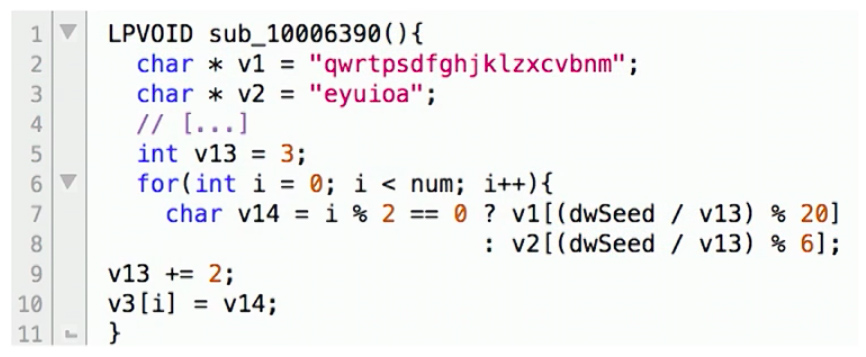
Smith discusses how his team created a new system called DREAM++ that can outputs more readable decompiled code, so we may get something like:
Source: The Source Awakens
By producing more readable decompiled code, both security experts as well as typical programmers were able to much more easily and quickly understand the decompiled programs.
Browser Warnings
Improving SSL Warnings: Comprehension and Adherence by Adrienne Porter Felt, Alex Ainslie, Robert Reeder, et Al. ACM Conference on Human Factors in Computing (CHI), 2015.
Security experts and programmers will always attempt to do what is best for their end-users, but the problem is that (very) often the end-user will circumvent any attempt at stopping whatever they intend to do. Looking at HTTPS specifically, the inherent security boils down to the end user’s choice of whether or not to proceed to a possibly unsafe webpage.
Therefore, it is the web browser’s responsibility to provide adequate notice to a user when their connection is not secure. Research conducted in 2015 by Google and the University of Pennsylvania found that reducing technical jargon in Chrome browser SSL warning and focusing on brevity and simplicity, resulted in an increase in comprehension of SSL warnings. Still, only 49% of the respondent’s could answer the following question correctly:
What might happen if you ignored this error while checking your email?
Your computer might get malware
A hacker might read your email
(Technically both are true, but realistically the user is supposed to understand that invalid HTTPS results in hackers being able to read your communications in plaintext)
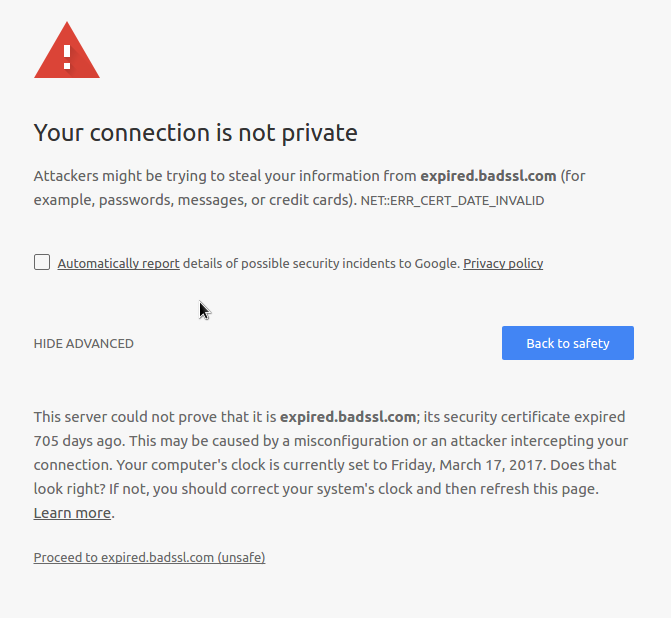
The researchers also found that the improved design of browser warnings could influence up to 30% more users to go “Back to Safety” rather than “Proceed to Unsafe”. The new design is shown below:
Source: Improving SSL Warnings: Comprehension and Adherence
If this seems familiar, it is because it was introduced in Chrome 37. This new design requires an extra click from a user to proceed to the potentially unsafe site. Notice that the unsafe option is a dark gray text link contrasted with a safe blue button.
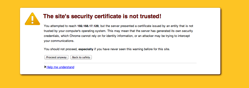
Below, a blast from the past: SSL warnings from pre-2015 Chrome versions.
Source: Self Signed Certificates with Postman
Noticeably, this has ‘too much’ technical jargon and is neither short nor simple. Similarly the user can easily proceed to the site straight from the warning. Google’s research was meant to improve the user experience when seeing these warning to minimize the security risks taken by the end-user.
TLS Errors on the Web
Here’s My Cert, So Trust Me, Maybe? Understanding TLS Errors on the Web by Devdatta Akhawe, Bernhard Amann, Matthias Vallentin, & Robin Sommer. International World Wide Web Conference (WWW) 2013.
The end-user isn’t the only source of security issues when it comes to browser usability in TLS. The behavior of web browsers may not be studied as much as vulnerabilities in TLS, but it is almost just as dangerous in measure. Usually when browsers report TLS errors, they don’t offer distinguishing features between real attacks and benign errors; hence leaving the decision to the end-user of whether continuing is itself a security issue. On most occasions, errors will turn out to be “false positives”, which can include errors due to server misconfiguration, self-signed certificates (as mentioned previously), and name validation errors. As a result, end-users quickly train themselves to click through these warnings, regardless of the content, making it unlikely that they will pay enough attention when a real attack comes along.
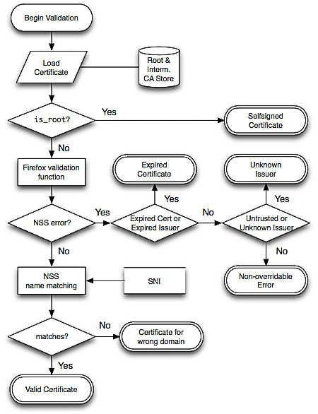
This paper reports on a large-scale measurement study of common TLS warnings. A total of 11.5 billion SSL connections on all ports were captured over a nine-month period in their experiment. The warnings and errors produced were then categorized based on where they occurred during the verification: chain building errors, chain validation errors, and name validation errors. These correspond to the three separate steps of certificate validation of the Network Security Services (NSS) library, used by Firefox (and Chrome on Linux). The following is an algorithm that can translate the NSS responses into their categorization:
Source: Here’s My Cert, So Trust Me, Maybe?
The results of this experiment indicate a clear opportunity, and need, for reducing false warnings. A 1.54% false warning rate is unacceptable if we understand that benign scenarios are orders of magnitude more common than actual attacks.
Based on this analysis, a number of concrete recommendations are proposed to help browser vendors lower the risk of such unwanted habituation. For example, advocating the use of free TLS certificates via authorities like StartCom, using a more relaxed name validation algorithm that accepts multiple levels for an asterisk, or enabling AIA support or preload all known intermediate authorities in the browser cache. By implementing these changes, the complete usability of browsers for end-users will be significantly improved, therefore leading to a drastic decrease in attacks and security issues caused by users.
Rethinking Connection Security Indicators
Rethinking Connection Security Indicators by Adrienne Porter Felt, Robert Reeder, Alex Ainslie, Helen Harris, Max Walker, Christopher Thompson, Mustafa Emre Acer, Elisabeth Morant, and Sunny Consolvo. Twelfth Symposium on Usable Privacy and Security (SOUPS), July 2016.
By seriously considering the ramifications of the symbology we use to send messages to the users, we can work to develop more useful and informative messages. This section focused on the findings of a study conducted to figure out how users react to various symbols appearing in their browsers (most often in the URL field). The study found that a surprising number of users could identify one or more of the significant features in a good connection, but the majority of users could not identify issues with a bad connection or one not using HTTPS.
Only about 40% of the people in the study were able to identify an HTTP connection as insecure or what protocol was being used; many of the participants believed the symbol had to do with the favicon of the page or that the symbol included general information about the page such as permissions. A summary of the results of this research can be seen in the table below.
Source: Rethinking Connection Security Indicators
The researchers attempted to identify the three symbols that would be the most effective for conveying information to the user. They then conducted more research regarding how users would interpret these symbols.
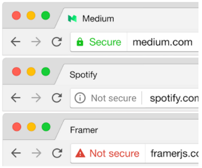
Source: Rethinking Connection Security Indicators
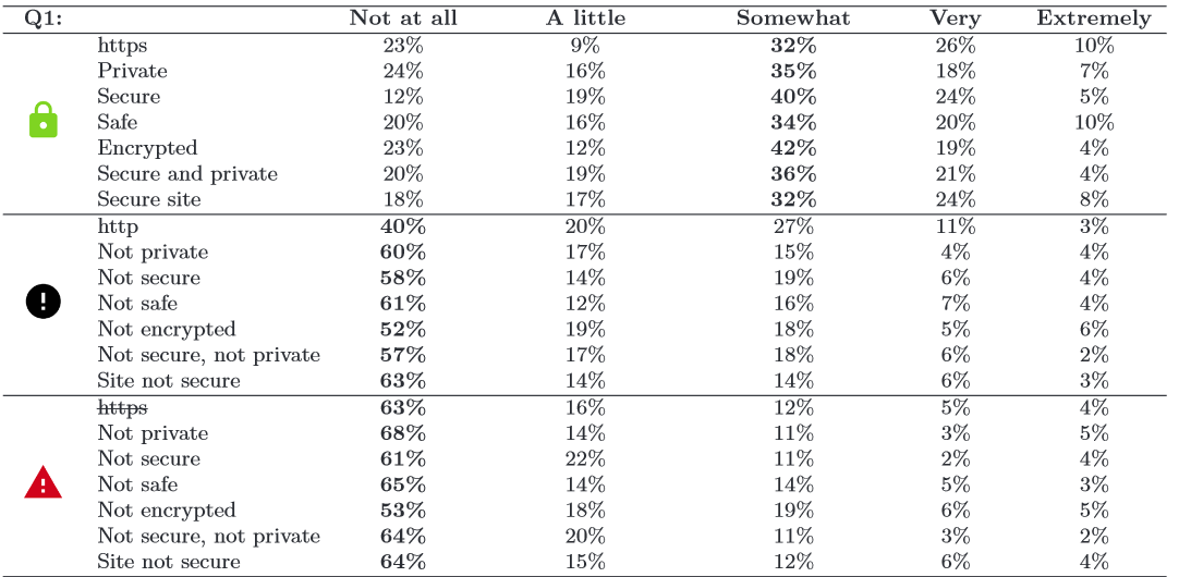
Source: Rethinking Connection Security Indicators
The researchers were able to confidently determine that any sign of an error is interpreted to be essentially the same, regardless of color or shape. Secondly, they determined that even if users were shown to be on https or ‘secure’ sites, they still had a ‘healthy level of paranoia’ in only being ‘somewhat’ confident in the security of the site that they were currently accessing.
Based on these results, browsers need to start asking what dangers on the internet are. Is it worse to have a fault in one’s implementation of their certificates or to not have HTTPS connection at all? Browsers can also consider blacklists of sites that are known for putting user’s information or connections at risk. Browsers could also do more to put security in a more central or significant location, such as having a pop-up before every page with information on the connection type and associated risks. We need to become more aware of what messages we’re sending to the users via the particular symbols that we choose for varying types of connections.
Conclusion
We’ve covered several studies showing progress, and the need for more research, in the area of usable security. Despite the work done to bridge the gap between experts and users, there is a still a gulf between each group’s understanding of the other. In some cases, browser designers assume that users know what a certificate is, while users assume that the green lock in their URL bar indicates a website is free of malware.
The philosophical debate between informing users more effectively and simply manipulating them to make “correct” decisions is also unresolved. The major browsers have adopted a hybrid approach with TLS error warnings that both provide basic information on the error and require significant user effort to circumvent.
Such error warnings are commonplace, which raises another issue. Users tend to become accustomed to error messages (habituation), assuming them to be false positives for genuine threats, because they actually are false positives in the vast majority of cases. Benign server administration errors account for essentially all TLS warnings that users see. Browser manufacturers are engaged in efforts to reduce the amount of noise users experience while sifting through warnings of potential hazards.
Work at the intersection of security and human-computer interaction continues to progress, but more needs to be done to ensure the security of future internet users. We can’t eliminate people, the weakest links in the chain, so we must remember design systems around their fallibility. While security is always at the forefront of most security researchers brains, we must also begin to consider the users who will be interacting with these features as a part of the system itself.